Case Study
DGA Digital Government Authority Standards
Osimah contributed to 11 government digital platforms within the DGA's Digital Experience Maturity (DXM) Index 2025, delivering Arabic-first UX design and high-fidelity prototypes, built to DGA standards, across priority government services.

Digital Government Authority (DGA) Standards
Osimah contributed to the development of 11 platforms within the Digital Experience Maturity Index (DXM) for 2025 belonging to the Digital Government Authority.
We have gained extensive experience through developing proof-of-concept strategic models and providing advisory services for high-priority government digital platforms, evaluated according to the strict criteria of the Digital Experience Maturity Index for the year 2025.
















































Methodology
Designing Arabic-First Government Platforms
Osimah has hands-on experience applying the National Design System, having successfully delivered projects built to DGA standards for Etimad and Absher, with a focus on high-fidelity prototypes tailored to the usability needs of Arabic-speaking users.
Key considerations
- Cultural FitEnsuring the design reflects local habits, customs, and user expectations.
- Ease of UsePrioritizing smooth browsing and fast access to core government services.
- ConsistencyMaintaining a unified design language across all platforms via NDS.
- AccessibilityEnsuring inclusive design for all users in line with WCAG standards.
Outcomes
- Deeper understanding of consistency needs across government portals, NDS capabilities, and the DGA ecosystem.
- Figma interfaces built on NDS Organisms, Components, Atoms and Icons, with full RTL layout conversion.
- Front-end implementation (responsive web + mobile app) using HTML and Tailwind CSS.

Proposed Solution — DGA Platforms
Proof of Concept
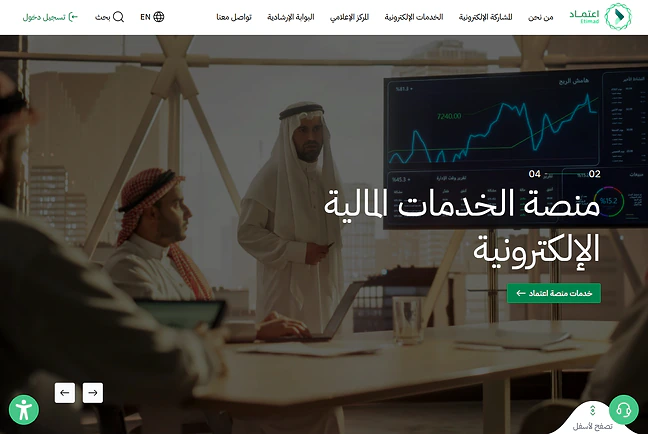
Improved Hero Section & Navigation
We enhanced the top navigation and Hero section to better support users with different language preferences and improve accessibility and usability. We also introduced clear Call-to-Action (CTA) buttons with National Design System components, keeping them easy to use and built to DGA standards.
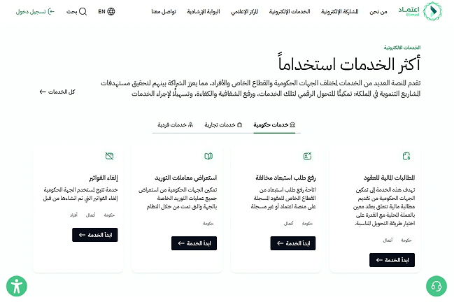
User-Centered Content Sections
We used and customized components from the National Design System (NDS), such as Tabs, Cards, and Icons, to highlight key products and organize services based on user type. The sections make browsing easier and are built to Digital Government Authority (DGA) standards.
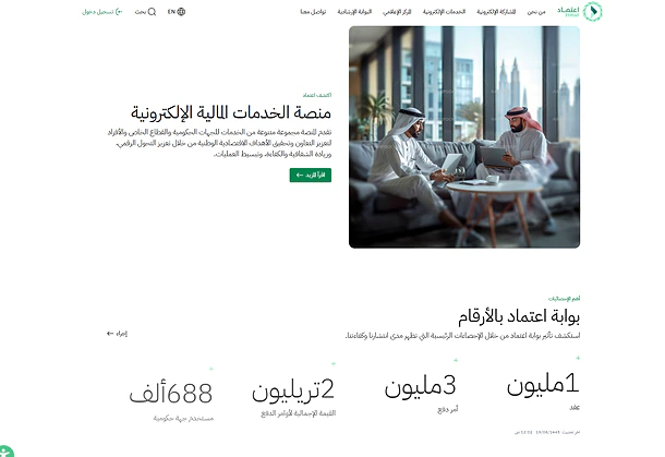
Clear Content That Builds Trust, Built to DGA Standards
We used the National Design System to design the “About Etimad” and “Etimad in Numbers” sections, incorporating clear visual elements and prominent Call-to-Action (CTA) buttons. This provides a quick and comprehensive overview while reinforcing trust, clarity, and accessibility.
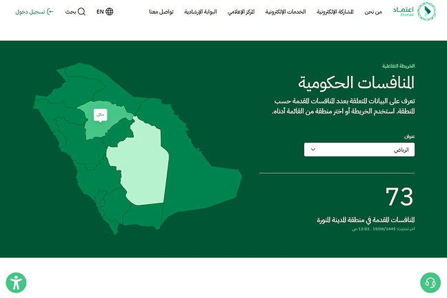
Geographic Insights Built to DGA Standards
We designed an interactive map to explore competitions by region, achieving a balance between customized interaction and the full use of National Design System (NDS) components, so the map is easy to use and built to DGA standards.
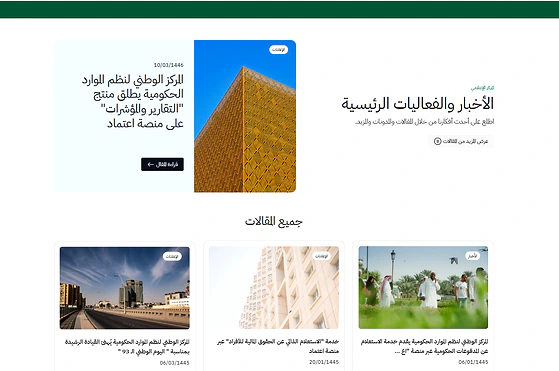
Engaging Users Through a Well-Organized News Section
We implemented a Grid Layout using Card components from the National Design System (NDS) to showcase news with images, dates, and categories. This provides a clear and organized visual experience that makes content easy to explore and encourages users to return regularly.
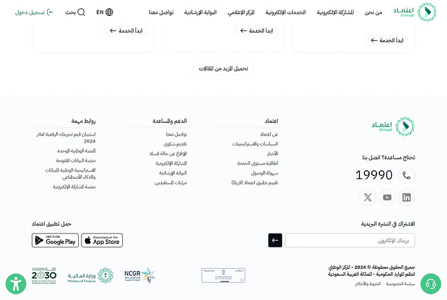
Designing a Reliable and Accessible Footer
We designed a Footer with National Design System (NDS) components, built to DGA standards and incorporating essential links, contact information, tags, and optional modules such as the newsletter. This ensures a smooth user experience and supports long-term scalability.
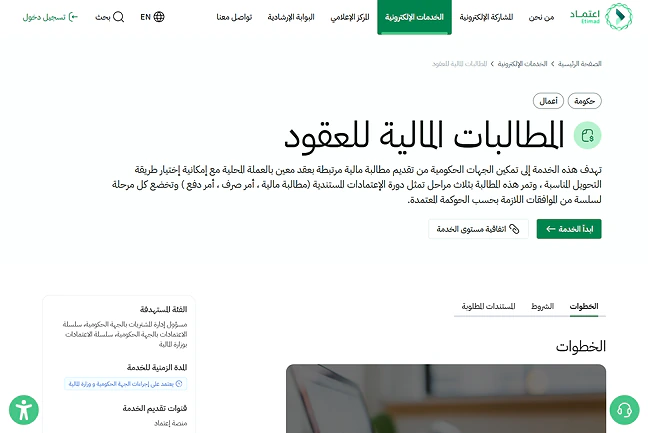
Visualizing a Clear and Accessible Service Page
We used components from the National Design System (NDS), such as Breadcrumbs, Tags, Icons, and Alerts, to create a transparent and information-rich service experience. This helps users quickly understand the service and easily take the required actions.
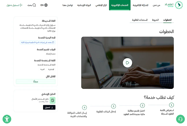
Organizing Content Using Tabs
Tabs divide information into clear sections, such as Steps, Requirements, and Documents, reducing user distraction and making it easier to find the right information quickly. They also support keyboard navigation and provide visual indicators for the active tab, following the National Design System (NDS) accessibility guidelines.
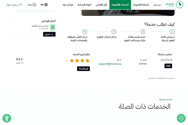
Side Panels to Support Informed Decision-Making
Side and bottom panels provide key service details and quick access to support, FAQs, and related information. They also enable users to complete tasks efficiently using National Design System (NDS) components, ensuring clarity, ease of use, comprehensive support, and seamless Right-to-Left (RTL) interface alignment.